Artwork up on the site.
-
GhaleonOne
- Ghost From The Past
- Posts: 9079
- jedwabna poszewka na poduszkę 70x80
- Joined: Wed Dec 25, 2002 4:59 am
- Location: Not of this world...
Artwork up on the site.
Not really anything else to say. If you want to see it, head to the Harmony section.
-G1
-
Sonic#
- Pao Tribe Chieftain
- Posts: 4680
- Joined: Thu Dec 26, 2002 3:27 am
- Location: Here, there, everywhere
- Contact:
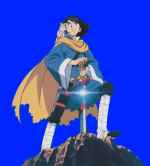
Re: New artwork for Harmony of Silver Star!
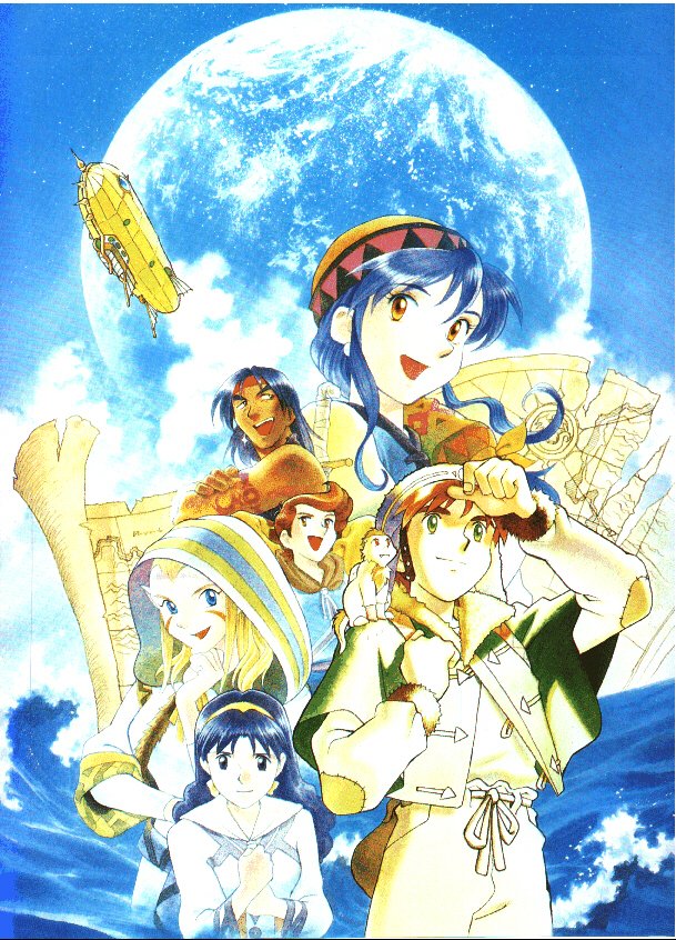
Alex's face aside, I really like this piece. First there's just the general swoopiness of the panoramic view, but I also like how the left side and the right side (Grindery and Temple of Althena) contrast, and how the Blue Star looks more crystalline than in other versions, which tend to look more like a lively Earth with their solid blues and clear whites, as with these three:
http://www.lunar-net.com/multimedia/artwork/tss4.jpg
http://www.lunar-net.com/multimedia/artwork/tss5.jpg
http://www.lunar-net.com/multimedia/artwork/sssc3.jpg
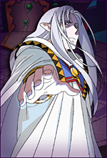
I also like the clothes. I don't recall seeing a full-body shot of Alex like this, with his leggings so clear before. The fur no longer marks a rim, but... well, I don't know what it does, but it's interesting. There are also no knee pads, but I can't recall whether they were in SSSC or not.
http://www.lunar-net.com/multimedia/artwork/tss4.jpg
http://www.lunar-net.com/multimedia/artwork/tss5.jpg
http://www.lunar-net.com/multimedia/artwork/sssc3.jpg
I also like the clothes. I don't recall seeing a full-body shot of Alex like this, with his leggings so clear before. The fur no longer marks a rim, but... well, I don't know what it does, but it's interesting. There are also no knee pads, but I can't recall whether they were in SSSC or not.
Sonic#
"Than seyde Merlion, "Whethir lyke ye bettir the swerde othir the scawberde?" "I lyke bettir the swerde," seyde Arthure. "Ye ar the more unwyse, for the scawberde ys worth ten of the swerde; for whyles ye have the scawberde uppon you, ye shall lose no blood, be ye never so sore wounded. Therefore kepe well the scawberde allweyes with you." --- Le Morte Darthur, Sir Thomas Malory
"Just as you touch the energy of every life form you meet, so, too, will will their energy strengthen you. Fail to live up to your potential, and you will never win. " --- The Old Man at the End of Time
-
Alunissage
- Goddess
- Posts: 7355
- Joined: Thu Dec 26, 2002 10:31 am
Re: New artwork for Harmony of Silver Star!
I'm pretty sure he only had the kneepads in TSS.
One nice bit about the dichotomy of the Grindery and the Goddess Tower is the sunlight and darkness. Which of course is standard symbolism, but since Althena's Light specifically doesn't shine on the Frontier there's a direct application to the storyline.
I will say though that the arrangements of the characters in the montage don't really work so well with the lighting effect. You have the two darkest characters also drawn the smallest and against the light background, looking even smaller and darker, while Luna is lit from somewhere and looks very bright.
-
GhaleonOne
- Ghost From The Past
- Posts: 9079
- Joined: Wed Dec 25, 2002 4:59 am
- Location: Not of this world...
Re: New artwork for Harmony of Silver Star!
For some reason, the artwork reminds me of Dragon Force. The one with Wein holding his sword in a similiar way Alex does, being center of the artwork with other characters surrounding him.
-G1
-
GhaleonOne
- Ghost From The Past
- Posts: 9079
- Joined: Wed Dec 25, 2002 4:59 am
- Location: Not of this world...
Re: Artwork up on the site.
More media has been added, all of which is untagged, including the artwork previously posted. Just check the site.
-G1
-
Zalbag

- Red Dragon Priest
- Posts: 143
- Joined: Mon May 29, 2006 4:11 am
- Location: Sampling my goods!
- Contact:
Re: Artwork up on the site.
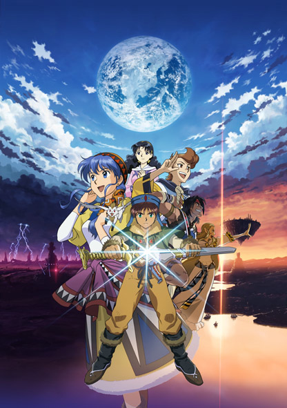
Quite possibly the best artwork for the series I've ever seen. Now to wait till it can be bought as a poster...what I wouldn't give for a wallpaper size
I carry [Dyne's Sword]
-
phyco126
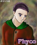
- Dragonmaster
- Posts: 8136
- Joined: Fri Dec 27, 2002 3:06 am
- Location: Colorado Springs, Colorado, USA
Re: Artwork up on the site.
That artwork is amazing to me. Beautiful in my eyes. If I had a wife, I would demand a divorce so I could run off with this artwork.
Is it me, or does Luna look younger? If not, it must be my age showing through.
Is it me, or does Luna look younger? If not, it must be my age showing through.
- "Sometimes life smiles when it kicks you down. The trick is to smile back."
Re: Artwork up on the site.
Agree, and I think Alex looks younger too o.Ophyco126 wrote:Is it me, or does Luna look younger? If not, it must be my age showing through.
"And yet, I've realized that maybe living a "decent" life means you won't ever have a "good" life."
-
liquidpolicenaut
- Red Dragon Priest
- Posts: 185
- Joined: Thu Jan 24, 2008 8:19 pm
- Location: Scottsdale, AZ (but always a NYer)
- Contact:
Re: Artwork up on the site.
Beautiful, b-e-a-u-t-i-f-u-l.....very pretty artwork 
Visit my Youtube site!!
LiquidPolicenauts YouTube Videos
LiquidPolicenauts YouTube Videos
-
Zalbag
- Red Dragon Priest
- Posts: 143
- Joined: Mon May 29, 2006 4:11 am
- Location: Sampling my goods!
- Contact:
Re: Artwork up on the site.
phyco126 wrote:That artwork is amazing to me. Beautiful in my eyes. If I had a wife, I would demand a divorce so I could run off with this artwork.
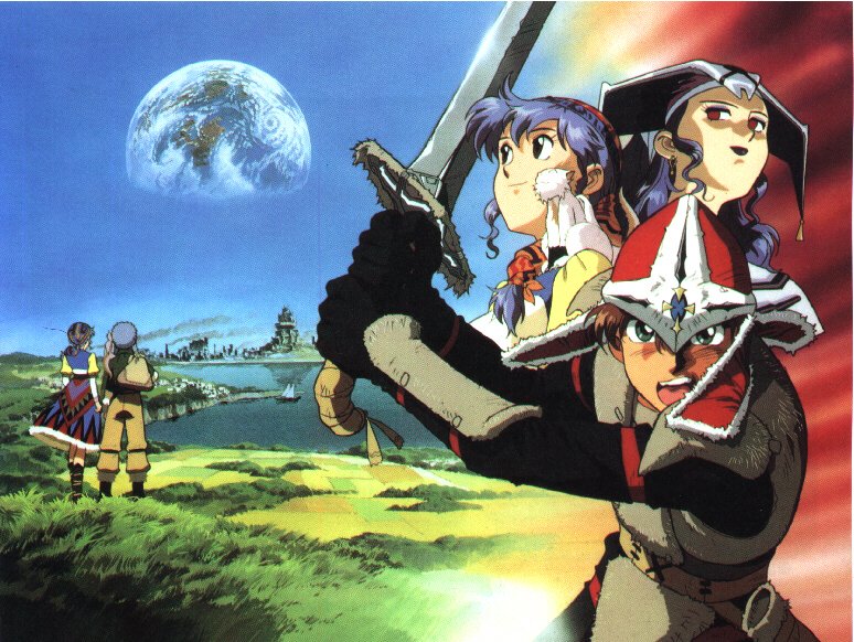
I couldn't have said it better. It's a very beautiful picture, very captivating. I like the right side alot more then the left, it's just so dang realistic, sunset is beautiful.
I carry [Dyne's Sword]
-
Alunissage
- Goddess
- Posts: 7355
- Joined: Thu Dec 26, 2002 10:31 am
Re: Artwork up on the site.
I merged the three posts from the topic in the News forum about this into this topic, but they all went to the beginning of the thread instead the end. >_< Just in case anyone wondered. I thought the posts with content other than the rather simplistic OMG PRETTY should be here also.  Seriously, folks, it's nice, but it's not unflawed. My first reaction was that Alex looks like he's having a major personality change. Previous artwork has generally had him looking cheerful in his adventurer clothing or (sometimes) serious and heroic in his Dragonmaster getup. This piece makes him look ticked off before he even has a reason to be. Also, the lighting is just weird.
Don't get me wrong. I love the background, and the collage is more or less okay. Certainly the individual pictures are fine, other than Alex as noted above. But I really think there are some balance issues in this piece.
Don't get me wrong. I love the background, and the collage is more or less okay. Certainly the individual pictures are fine, other than Alex as noted above. But I really think there are some balance issues in this piece.
-
PrettyGirlJean
- White Dragon Knight
- Posts: 782
- Joined: Thu Jun 23, 2005 4:20 am
- Location: Amherst, NY
- Contact:
Re: Artwork up on the site.
I love the contrast of the newest poster in regards to the light and dark. As Alun mentioned, the lighting on the actual characters is kind funky... It's almost like they were just photoshopped on there. I would still get the poster mind you, but I think Kyle and Jessica are the only two that are accurately affected by the lighting in the background. The rest have this bright light (coming from where?). I think Luna and Alex look a tad too young too. But for Luna maybe it's just the angle?
Overall still nice. I hope though that there will be more art, maybe even a new artbook?
Overall still nice. I hope though that there will be more art, maybe even a new artbook?
-
Monde Luna

- Blue Dragon Ninja
- Posts: 691
- Joined: Sat Aug 20, 2005 4:55 pm
- Location: Between here and there
Re: Artwork up on the site.
Okay so I looked at individual pics on L-net for HSS and most of them seemed a little off. Does anyone else feel that way or is it just me? I think Nall and Ramus are perfect but there is something not quite right with Alex, Luna and Nash... Maybe I am going crazy. Either way I am sooooooooo excited.
Re: Artwork up on the site.
Zalbag wrote:
Quite possibly the best artwork for the series I've ever seen. Now to wait till it can be bought as a poster...what I wouldn't give for a wallpaper size
wow this on is really good, i haven't seen this one before is it for the new game?

-
Kaiya-Sky

- Black Dragon Wizard
- Posts: 342
- Joined: Fri Jan 09, 2009 2:02 am
- Location: Canada B.C
- Contact:
Re: Artwork up on the site.
I dont like this art very much. The background is really nice, and Mia looks the best, but everyone else looks, i dont know, They could have just been drawn better. I like the old art better. In the individual character art work they look pretty good, except luna.
I cant wait for this game tho, the in game style looks so cute.
I cant wait for this game tho, the in game style looks so cute.
Who is online
Users browsing this forum: No registered users and 10 guests