Lunar: A Tear in Time Comic WIP Sneak Peek

For people with stuff to show off. Artwork, music you've composed, websites you've designed, etc. Put it here.
Post Reply
User avatar
PrettyGirlJean
White Dragon Knight
Posts: 782
jedwabna poszewka na poduszkę 70x80
Joined: Thu Jun 23, 2005 4:20 am
Location: Amherst, NY
Contact:

Lunar: A Tear in Time Comic WIP Sneak Peek

Post by PrettyGirlJean »

Hi everyone!

Sorry I've been kind of... gone, lately ^^; A lot has been keeping me busy, but things are settling down so I'm now able to start focusing on my art once more.

I will still continue work on Lunar TES with Zophar/Paul. But I will also be working on a comic project based on a piece of Lunar fanfiction I wrote quite a long time ago (Lunar: A Tear in Time). I will be changing the story here and there to accomodate the visual version, but also scrapping elements that didn't quite fit and whatnot. Some of you may even remember reading it, and if you liked it, hopefully you will like my comic as well :)

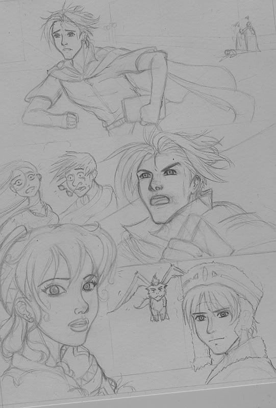
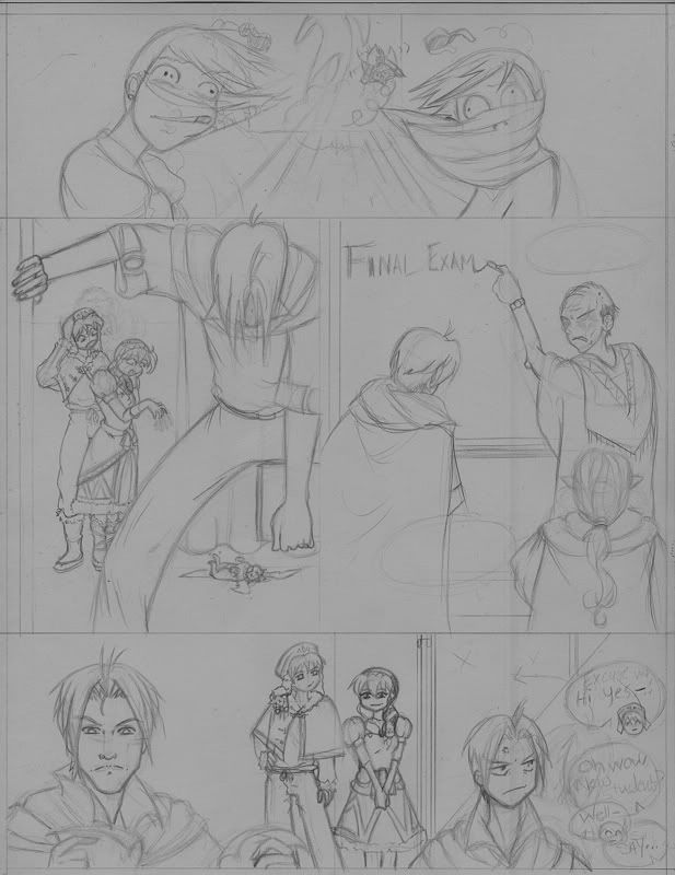
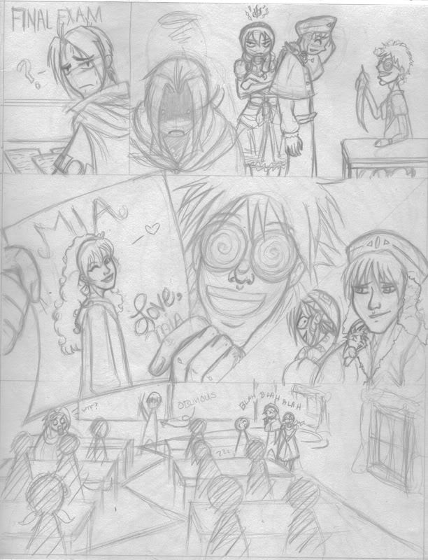
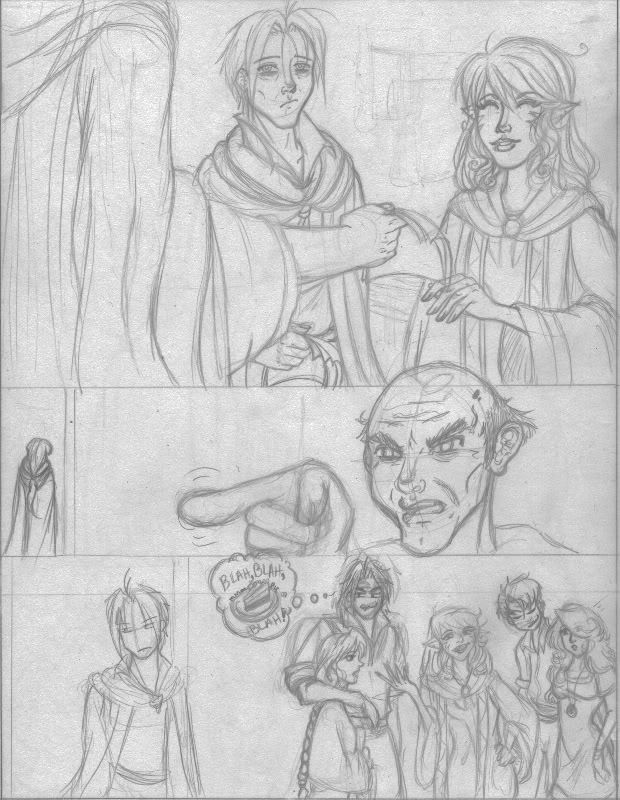
I don't have a preview of the panels of the comic, but I have a work in progress (WIP) of the first "cover" for "issue" one (below). I have already done storyboarding and covers for the first three issues: the first issue will have 16 pgs, issues two and three will have 13 pgs respectively. My hope is to post a finished issue bi-monthly (or as close to bi-monthly as possible). It will be in full color so that's why I'm hoping ^^; With work on TES it'll be quite a feat if I can manage it. I was thinking of black and white instead of color, but then I feel like I'll just rush it. I dunno, maybe that sounds silly :p At any rate, I'm planning on releasing the first issue around Christmas at the latest, I'm working on pencils right now so it shouldn't be too hard to do so.

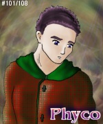
Anyhow, with all of that being said, here is a quick little sneek peek at the cover for issue one:

Image

Any comments are very welcome, but please, constructive criticism, thanks! ^_^b
Last edited by PrettyGirlJean on Sun Jun 29, 2008 10:40 pm, edited 1 time in total.

User avatar
LuNaRtIc
Bromide Hunter
Posts: 1588
Joined: Mon Feb 23, 2004 4:21 pm
Location: Taben's Peak

Post by LuNaRtIc »

Sorry I can't give out a whole lot of constructive criticism, I think this is absolutely gorgeous. *_* And I do recall catching some of this art around DevART before while surfing through lunar works. Very interested in reading and seeing how this turns out! :D
Image
「美しい白い竜 愛しい白い竜…」
My avatar art was done by luleiya! <3

User avatar
Nobiyuki77
Legendary Hero
Posts: 1329
Joined: Tue Apr 01, 2003 5:16 pm
Location: Wakayama, Japan

Post by Nobiyuki77 »

That looks quite lovely! ^_^
-Nobi

User avatar
AnimeJei
Red Dragon Priest
Posts: 189
Joined: Thu Jul 05, 2007 4:17 am
Location: FL, Japan, LUNAR/Lost forever in the Weird Woods

Post by AnimeJei »

Awesome work! All I can say is maybe some shading/highlights on the guy (but still looks great!), and she's perfect! Great work and I am big on logos, so nice logo too!
Image"Sample my goods!!"

User avatar
phyco126
Dragonmaster
Posts: 8136
Joined: Fri Dec 27, 2002 3:06 am
Location: Colorado Springs, Colorado, USA

Post by phyco126 »

I can't give constructive critisismsmsmsssismsmssofdeathsmsimsim.

However, I can say that suddenly I am looking forward to this already! Lunar + Comics = ? Orgasm is what I'm hoping, I'll have to consult the mathmaticians though.

Nice to see another Lunar comic being done ^^; Well, at least a real one. :P
Image

- "Sometimes life smiles when it kicks you down. The trick is to smile back."

User avatar
Alunissage
Goddess
Posts: 7353
Joined: Thu Dec 26, 2002 10:31 am

Post by Alunissage »

I assume the male is still a work in progress, since he's shaded so little compared to the female? That being the case, it's hard to say what the lighting is supposed to be. The shadows on the base of her neck, which look as if she's lit from below, don't seem to go with her face, which is lit more from the front.

Her robe suggest she's lit from the viewer's right, but in that case there should be more shadow on her neck from her chin and probably similar with her nose. That one's harder to pin down, though. It might be safest to just diminish the shadow already on her neck from her collar and leave the light fairly diffuse, as it is on her face.

It seems that her hair is too square for her head. It doesn't drape like Nash's hair (whose does?) but with it being as high on the left (her left) side of her head, it looks like there's a wind blowing from the right/front to push it up like htat. But the rest of her hair and her garments aren't windblown. I'm just not seeing any structural reason for the shape of her hair to be that way. Likewise, the two blue strands of the male's hair are utterly puzzling; they look like feathers.

Her ears seem very horizontal to me, moreso than I expect that type of beastman. On the other hand, having acquired cats in the past couple of months, I've appreciated how much their ears move, and perhaps a beastman's would as well. In which case she'd look very perturbed, which she does already.

I like the logo, although the lettering seems a bit thin given the blocky logos we're used to. Nice touch to have the A higher than the rest. One concern is the curlicue at the end of the L being behind the T, obscuring the shape of it. I have a very hard time seeing that immediately as a T and would advise either removng that last curl entirely or angling it to land between the A and T of the subtitle.. The R in Tear also is a bit too short to read as an R rather than a dotless I. (and is it "tear" like eye liquid, or "tear" like "sunder"?)

Overall, the style and layout is very nice, and well in keeping with the Lunar style a la Funato. The nose on the silhouette is a bit oddly shaped, blunt rather than pointy or rounded, but for all I know it could be Althena as a Mauri-style beastman back there. ;) I do wonder if the area around the face is a bit too empty, though; that's the point of least coloration and lowest contrast, and all there is is a flock of birds, placed a bit low. I'm not sure what to suggest there, though. It may be that all that is necessary is to define the complete circle that you see around the back of the silhouette's head, rather than just fading the background sky back in below the birds. I think the main problem is that that edge of the picture looks unfinished. Of course, perhaps it is.

I'll probably have more useful commentary after the shading is done, or at least further along.

User avatar
PrettyGirlJean
White Dragon Knight
Posts: 782
Joined: Thu Jun 23, 2005 4:20 am
Location: Amherst, NY
Contact:

Post by PrettyGirlJean »

Thank you all VERY much for your comments! I have to run to work now so I can't reply with everything I have to say, but I will afterwards. I do want to say thank you and I really appreciate the replies. The whole thing is a work in progress, so I'm glad to have things that weren't so obvious to me pointed out so I can fix them :) I think one reason I hadn't finished this long ago is that I'm still very up in the air about the logo, I'm not entirely happy with it (or the lighting). So those are the two major things, but I'm seriously taking other things mentioned into consideration as well.

Take care now! ^_^b

User avatar
Zophar
Black Dragon Wizard
Posts: 304
Joined: Thu Oct 27, 2005 9:01 pm
Location: West Chester, PA

Post by Zophar »

Holy crap, that's amazing! I can't wait to see the comic when it's completed. :)

User avatar
Bravo 29
Red Dragon Priest
Posts: 127
Joined: Mon Sep 19, 2005 7:23 am

Post by Bravo 29 »

Now that's some amazing art, Danni. My only personal complaint is I can't seem to determine their age by looking at them. Maybe it's just your art style, I don't know. Well, that and the shading problems with Portia. Other than that, I like it. I even liked the little black heart in the logo. Definitely fits in nicely with the story. Can't wait to see it published.

BTW, I know you're really swamped now, but are you planning to start the Tear in Time fandub again? I'll definitely voice act for you, no problem. Well, until later.

User avatar
Alunissage
Goddess
Posts: 7353
Joined: Thu Dec 26, 2002 10:31 am

Post by Alunissage »

A very quick note: on my work monitor, the contrast between the sun and the sky around it shows up a lot better; on my laptop, which has rather poor contrast, it barely showed at all. Still, I'd suggest making it a bit darker anyway. Oh, and I like the shape of the black heart in the logo, but with the hightlighting it looks a bit too much like a torso... which I think also didn't show as much on my low-contrast laptop screen. If you intend it to look dimensional I would definitely advise putting a rim of light around the left or right border.

User avatar
LuNaRtIc
Bromide Hunter
Posts: 1588
Joined: Mon Feb 23, 2004 4:21 pm
Location: Taben's Peak

Post by LuNaRtIc »

Bravo 29 wrote:BTW, I know you're really swamped now, but are you planning to start the Tear in Time fandub again? I'll definitely voice act for you, no problem. Well, until later.
Me too if you'll have me! ^^;
However if not, no worries! I know I'm volunteering myself. >_>
Image
「美しい白い竜 愛しい白い竜…」
My avatar art was done by luleiya! <3

User avatar
PrettyGirlJean
White Dragon Knight
Posts: 782
Joined: Thu Jun 23, 2005 4:20 am
Location: Amherst, NY
Contact:

Post by PrettyGirlJean »

Hi again everyone :)

I still don't have time to make a longer post, but wanted to give out thanks again for taking the time to look over my drawing. I'm hoping to get some substantial work done it tonight so I can post again for your comments. I really want to complete it tonight, unfortunately I don't know how much time I'll have to work with.

@ Zophie: Thanks :)

@ Bravo: Right now the fandub is on the last backburner of a long line of stoves I'm afraid. But I'll definitely keep you in mind when I begin work on it or any project that would require some voice acting :)

@ Lunartic: I'll definitely keep you in mind as well for some voice acting :D

@ Alun: I wanted to thank you real quick specficially for your comments about the hair and nose on the shadow in the back. I think they look much better now with the revisions so far!

I have to run now guys. Again, hopefully I'll have something a bit more substantial to show you later. Take care now!

User avatar
PrettyGirlJean
White Dragon Knight
Posts: 782
Joined: Thu Jun 23, 2005 4:20 am
Location: Amherst, NY
Contact:

A Nice Update ^^

Post by PrettyGirlJean »

Hi all!

Well, I wanted to show that I'd taken seriously the suggestions posted :) I still haven't completely finished this piece yet. But I have worked on it for the majority of today. I just decided to try and go all out with the background. It really did look kinda weak before compared to now. I created another logo which I'm still not 100% happy with, but I feel it's better than the other one.

I just started working on Yasuo, but I've only finished with his eyes and started on some basic shading. I think I have a general idea of where the light is coming from. Obviously from the back, but I'll have some light off to the right (in front). I did some minor touch ups for areas where the colors were bleeding over the lines. Unfortunately, whenever I shrink it down it bleeds even more. I don't know why it does it or how to prevent it yet, so I apologize that its a bit messy :( It's most noticeable around Yasuo's eyes.

Anyhow, I'll stop rambling now. I know it's still not complete, but any constructive criticism is always welcome.

Thank you all very much!
Last edited by PrettyGirlJean on Sun Jun 29, 2008 10:41 pm, edited 1 time in total.

User avatar
CatsWithMatches
Red Dragon Priest
Posts: 184
Joined: Mon Apr 02, 2007 6:00 am
Location: Brandon, Wisconsin
Contact:

Post by CatsWithMatches »

Not sure how I missed it, but I hadn't noticed the silhouette before - love it.

I like the old logo better (looks more stylish), but it should be thicker.

And the background adds a ton.

Looking good!

User avatar
Dragonmaster Lou
Black Dragon Wizard
Posts: 483
Joined: Thu Oct 06, 2005 8:58 pm
Location: Massachusetts
Contact:

Post by Dragonmaster Lou »

That is some gorgeous artwork for the cover. Wow... I'm not sure what I can offer as far as useful criticism, so how about just cheerleading? :)
"Guts can turn a 30% chance into a 100% chance!" - Taiga Kohtarou
Personal home page: http://www.techhouse.org/~lou
Lunar page: http://www.techhouse.org/~lou/lunar/
AMV page: http://www.tealstudios.com

User avatar
PrettyGirlJean
White Dragon Knight
Posts: 782
Joined: Thu Jun 23, 2005 4:20 am
Location: Amherst, NY
Contact:

Post by PrettyGirlJean »

@ Tao: Thanks! ^_^b

@Lou: Thanks a lot for your compliment as well! Cheerleading is acceptable ^_~b haha

User avatar
Bravo 29
Red Dragon Priest
Posts: 127
Joined: Mon Sep 19, 2005 7:23 am

Post by Bravo 29 »

Yes, Yasuo looks much better in the second version, looks more, human I guess. And I love the dark clouds you added to the sky, definitely denoted the sinister turn the story takes. Can't wait to see the final version, keep up the great work. :D

User avatar
PrettyGirlJean
White Dragon Knight
Posts: 782
Joined: Thu Jun 23, 2005 4:20 am
Location: Amherst, NY
Contact:

Post by PrettyGirlJean »

Hi all,

I don't have any images to post, but I thought that for those interested I've just started work on the pencilling for page 3 of the comic. 1 and 2 are complete. I'm thinking that I'll pencil the first issue then go about inking in photoshop, the tedious work of coloring. It's coming along slower than I'd hoped, but I'd anticipated as much.

I'm really looking forward to getting the first issue complete (hopefully in January). Alex, Luna and Nall have quite a bit of time in the spot light already :D

That's all for now, I'll probably update you all again in a couple weeks :)

User avatar
PrettyGirlJean
White Dragon Knight
Posts: 782
Joined: Thu Jun 23, 2005 4:20 am
Location: Amherst, NY
Contact:

Re: Lunar: A Tear in Time Comic WIP Sneak Peek

Post by PrettyGirlJean »

*Update Bump*

Hi all!

Sorry I haven't been around much lately. A lot of lifestuffs been keeping me busy. Anyhow, I am still working on this project! It's just very slow going. I had really hoped to share the first issue when it was complete, but since that will probably be a while, I thought I'd share what I do have so far, and exclusively on this site, so please if you see my lunar art somewhere else please let me know (well, other than my DA acct :p )!

I am sharing pgs 1-4 of the comic, still major WIPs, but the backgrounds inks and colors will all be done in Photoshop and will look a lot nicer :) I'm currently working on Pg 5 but haven't completed enough to feel it worth sharing just yet.

Even though the pgs I'm sharing are just WIPs for now, please feel free to comment on them anyway. If you don't quite get what I'm drawing or something sticks out like a sore thumb please comment! I welcome any and all constructive criticisms! As quite a few of you know, I do take comments seriously and my work does reflect them, so please don't feel like what you may be thinking doesn't hold weight. While I am doing this for my love of Lunar, I am also doing this project for all fans too :)

Anyhow, enough rambling, here's mah progress thus far:

Page ONE:
Image

Page TWO:
Image

Page THREE:
Image

And, Page FOUR:
Image

If these are not showing up for you please let me know and I'll get to work fixin' the problems :)

Thanks a lot guys!

User avatar
Bravo 29
Red Dragon Priest
Posts: 127
Joined: Mon Sep 19, 2005 7:23 am

Re: Lunar: A Tear in Time Comic WIP Sneak Peek

Post by Bravo 29 »

Whoa, those are very nice. Doesn't look too much different from the original storyline, but that could easily be the idea, isn't it? I loved the story, though it's painful to watch what befalls Yasuo, not to mention Portia. And in the graphic novel, it'll be more so. I'll still read it, though, it looks quite promising. Might need a hanky though before the last issue. Cya.

Post Reply

Who is online

Users browsing this forum: No registered users and 27 guests