
Any and all suggestions are welcome.


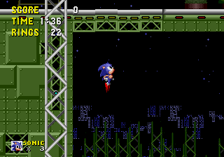
Yeah, depending on the changes, I may just omit the water all together.TaoTeCheese wrote:The shading on sonic is great. Nice and deep.
If that's supposed to be water below the buildings in the background, it doesn't quite look like it.
Otherwise, it rocks. What's the medium?
Wow, that's amazing. I can give it the old college try, but realistically I've 2 more days to work on this, which considering I work 8-5 Mon-Fri means about 8-10 maximum >>;;LuciaOne wrote:Also you should establish visual hierarchy- everything right now has the same weight, so Sonic doesn't pop as well as he could be. Right now the sky is as saturated as Sonic, making them feel like they are on the same plane. Try looking up some reference on what you want to say.
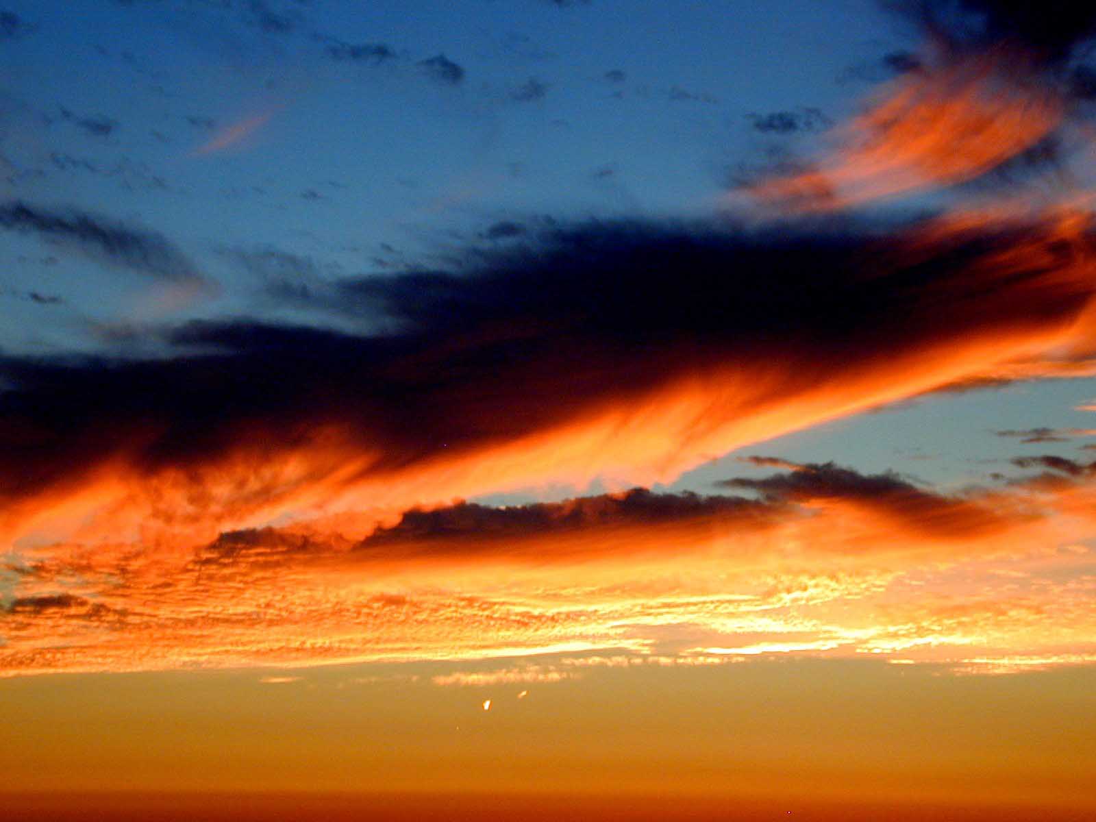
This is kind of an example, it has a city in the background that really drops out to give an amazing sense of space:
http://img240.imageshack.us/img240/3794/madhaven7ts.jpg
Atmospheric perspective will help a lot =]
My only concern is do you think lowering the buildings/horizon would mess up the perspective on Sonic and the track? Would I need to paint the tops of the buildings and paint more buildings behind them to make it look right?LuciaOne wrote:Edit: Also, maybe dropping the cityscape horizon line way lower in the picture could make them seem really high up- right now they seem to be 5 feet above the water. The negative space will really help the area around them breathe, too. Plus you can paint a sky of wicked clouds then


Yeah, that's my favorite scene of all-time, too!Nobiyuki77 wrote:That's exactly the scene I'm illustrating. The contest is to draw your favorite scene from any Sonic game.
Sonic CD forever! ^_^


A special gallery in Sonic and the Black Knight will feature the 20 winning pieces, and the winners get a free copy of the game.Silver Phoenix wrote:What's the prize?
Users browsing this forum: No registered users and 25 guests


